- Customer project
- UI Design
- UX Design
- Research
- Usability Testing

CHALLENGE/PROBLEM
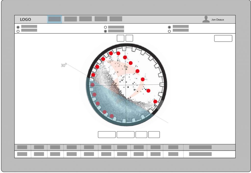
The Trajit (pronounced “Tri-it”) Application was created for the Swedish branch of Metso Mining Company. It allows mining engineers to interface with the backend scientific algorithms to create a visual interface display allowing the user to make adjustments without having to petition the work be done by the scientist that developed the backend program. My role as UI/UX Senior Designer was creating an engaging interactive interface that would simplify the user process. I collaborated with developer, scientist, and engineers.

APPROACH
After interpreting available research, I created low-fidelity wireframes using Balsamiq, Sketch and Invision to iterate through design options quickly. Working with scientist, TRAJIT Metso Mill Liner Trajectory Simulation Application 2 developers and stakeholders I used the wireframes to discuss and create product strategy. Design does not exist in a vacuum so I undertook the task of understanding our product from a user centric perspective. I used Invision to create prototypes allowing the users to experience several task. What at times may have seemed intuitive was not always clear to the users. This gave me valuable insight on how to adapt an interaction to better accommodate the user. I also did research on competitors for product comparison. This allowed me to see what the competition was doing right. I prefer starting very basic using low-fidelity wireframes. This allows me to concentrate focus on the initial functionality. I used Balsamiq and Invision to iterate through the design process. By creating prototypes I gave the users a chance the experience an interactive version of the application. This gave the user a prelude of what to expect in look, feel and interaction of the application. It gave me valuable feedback on whether we were still building the right application.

RESULTS
I learned a great deal about simplifying complex applications. I created a more intuitive application using progressive disclosure concepts. It became clear the scientist/developers were unable to see the application as a user. The project had many challenges, but the most difficult part was working with the 8 hour time difference which hindered user feedback response time. I was able to compensate by using Trello to communicate with stakeholders by posting and responding to message boards. The final product ended up being totally different from the initial concept. This allowed the design to go through developmental iterations that narrow in on what the user wants before the code is written.
SKILLS
Design:
- Adobe Creative Suite
- Invision
- Figma
- Illustration & UI graphics
- Strategy
- User Flows
- Concept Sketches
- Wireframes & Mockups with Sketch, Illustrator & Photoshop
- Style Guides & Pattern Library
- Design Thinking
- User Centered Design
Prototyping
- Rapid Prototyping using Keynote, Invison & Axure
Research
- Data Analysis
- Persona Hypothesis
- A/B Testing
- Cognitive Walkthrough
- Information Architecture