- UI Designer
- Lead: User Research
- Usability Testing
- UX Research:
- Heuristic evaluation
- Interviews
- Personas
- User/Task Flows
CHALLENGE/PROBLEM

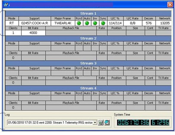
Satellite communication software is very complicated. There are very complex algorithms involved using physics derived formulas. To the engineers that create the applications it makes perfect sense to display EVERY output on the front interface. To the user however this becomes visual noise causing the user angst and mental fatigue. My job as UI UX designer is to create a better user experience making order out of chaos.
APPROACH
For this project I analyzed what users liked and didn’t like about the current application. Since the original application had a status indicator panel it seemed a better design would incorporate iconography which would not only replace text with icons but also allow status indication. There was initial push back from legacy developers with questions like, “Why do we need to change the interface it’s been working fine so far”. I would point out that we are not building applications for ourselves but for our customers. Since customers were complaining that our competitors were looking more modern it would be in our best interest to become proactive in improving our applications with the user in mind. I also solicited feedback and input from the very developers which thought the process was not necessary. With everyone having buy in it became less productive for the detractors.
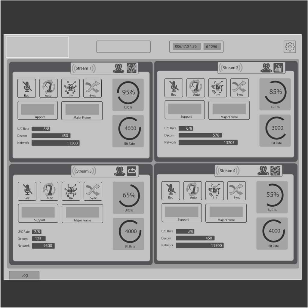
After numerous rounds of collaborative sketching, brainstorming and white boarding I began to get a concrete concept of how to improve the user experience. I created personas so the focus would remain on the type of users that would be using the new interface. Once I had a working concept I began wire framing. This would lead to more collaboration amongst stake holders. I created wireframes and sent them to users. I encouraged honest feedback and finally developed a good flow and design for the application.

RESULTS
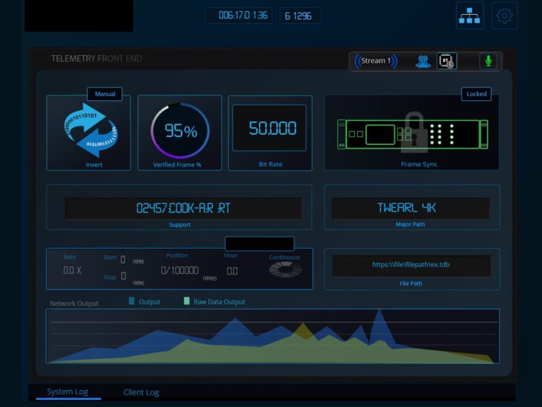
After several iterations I created high fidelity mockups which also received favorable feedback from users. Through the use of clickable prototypes I was able to verify the validity of the design and interaction of the users. Users commented: “This design is so much more elegant than the old interface”, ”It looks so much more modern”. Having created a style guide I was ready to hand things over to the development team.

SKILLS
Design:
- Adobe Creative Suite
- Invision
- Figma
- Illustration & UI graphics
- Strategy
- User Flows
- Concept Sketches
- Wireframes & Mockups with Sketch, Illustrator & Photoshop
- Style Guides & Pattern Library
- Design Thinking
- User Centered Design
Prototyping
- Rapid Prototyping using Keynote, Invison & Axure
Research
- Data Analysis
- Persona Hypothesis
- A/B Testing
- Cognitive Walkthrough
- Information Architecture
