
Readiness Dashboard is a desktop application supporting the 521st Contingency Readiness Squadron’s need to have reliable, current data for the readiness of their squadron.
1. Discovery
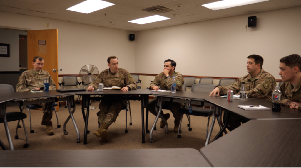
Members of the UX design team (myself, Cole Stamm, and Ed Mikos) travelled to McGuire Air Force Base in New Jersey for a 2-day discovery session with our stakeholders, the 621st Contingency Response Squadron, where we worked with several groups of users, which constituted our personas, at different seniority ranks (Airmen, Supervisors, and Commanders).
Research Methods used:
- Contextual Inquiry, Focus Groups & Cognitive Walkthrough
2. Contextual Inquiry
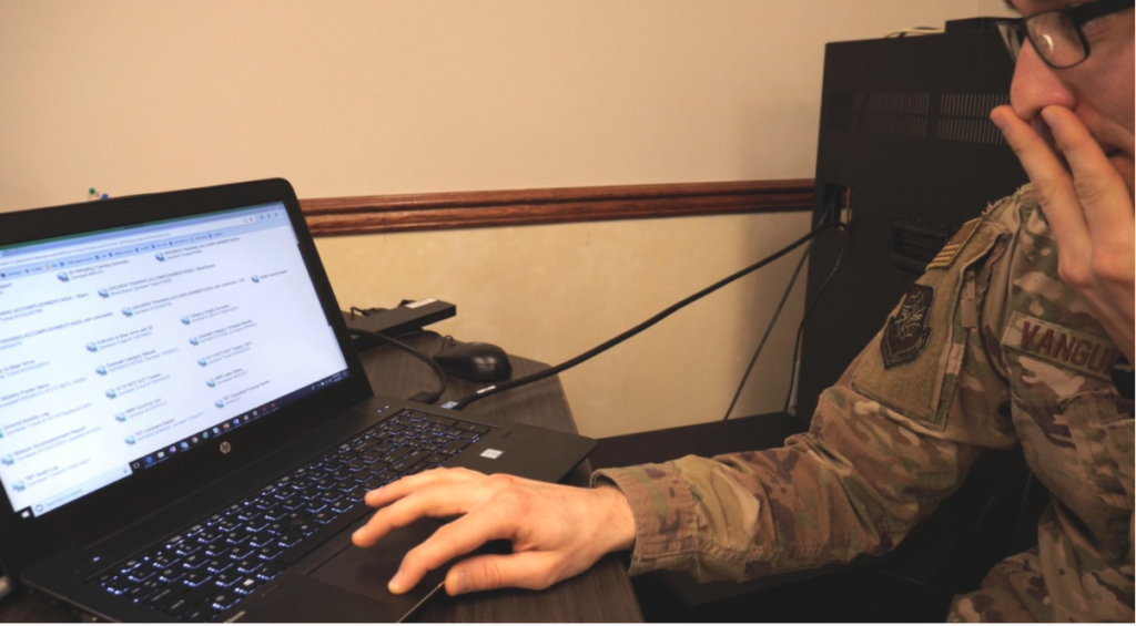
A supervisor at McGuire Air Force base sat down with us and went through his usual process of updating his readiness in their system. The UX team took notes and videotaped the process as we encountered a series of pain points relating to usability, system latency, lack of intelligent defaults, and unintuitive interfaces.
The UX team went through the contextual inquiry process with three levels of users (which helped us form our personas) and documented each of their experiences attempting to complete specific tasks related to their jobs, paying attention to not only what they said but also to what they did in real time.
The commander that we observed said about the system,
“We’ve got so much great data out there that’s not filtered and not accessible like it could be.”
3. Research Synthesis
After getting back from the discovery trip, we began synthesizing our findings into empathy maps, personas, and a discovery report capturing all of this information along with specific user pain points.
We created empathy maps for each user documenting their tasks, feelings, influences and pain points (as show below).
Airman Empathy Map

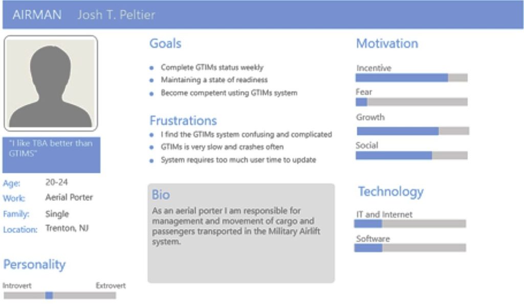
Personas
We also created personas for the Airmen, Supervisors, and Commanders based on our research. An example of our persona for an Airman is shown below.
4. Wireframes
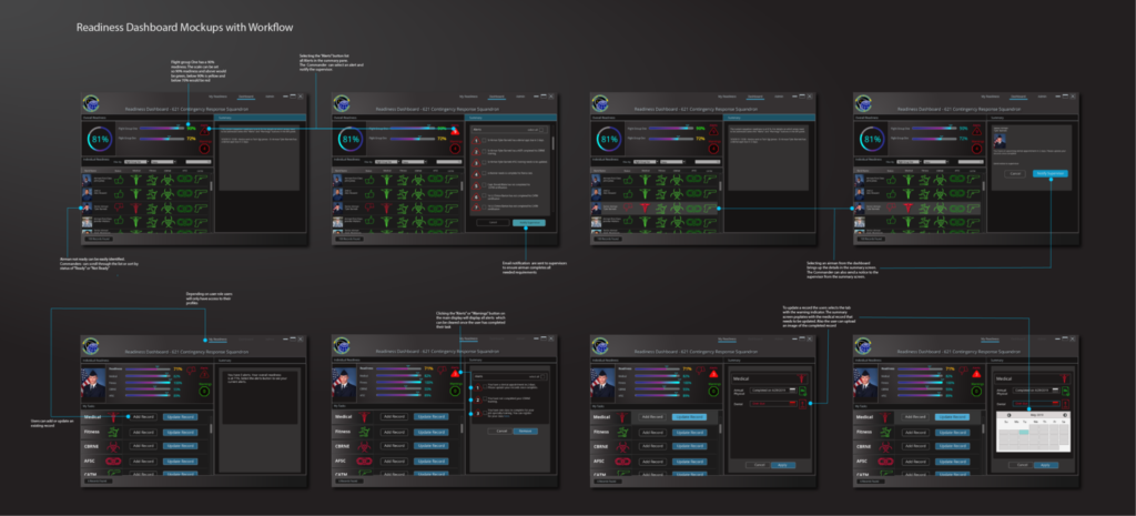
Taking our research, video transcriptions, personas and empathy maps we were able to identify user tasks and more intuitive interfaces to help solve our users’ pain points.
As the lead UX designer, I created the initial wireframes and user flows which featured geo icons to help quickly navigate interfaces as well as progress bars showing the squadron and airman level readiness, as well as a list of tasks that needed attention, the priority tasks being given alerts in a side window when a task requires immediate attention or is overdue.
The interface was able to keep the user in one system, rather than several as they are used to, to both check their readiness and update it.
5. User Testing and Iteration
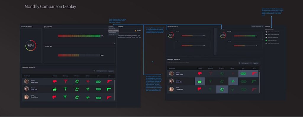
The demo, which was coded by the development team, was remotely tested with a stakeholder as the UX team observed. A key feature the stakeholder thought was missing was the ability to compare dashboard results. Based upon this user feedback the dashboard comparison functionality was incorporated in subsequent designs.
6. Outcome
The Readiness Dashboard application is waiting to be deployed after data access is granted to use on the back end. Once implemented, it has been estimated the application will save 5.2K man-hours per year per wing.
SKILLS
Design:
- Adobe Creative Suite
- Invision
- Figma
- Illustration & UI graphics
- Strategy
- User Flows
- Concept Sketches
- Wireframes & Mockups with Sketch, Illustrator & Photoshop
- Style Guides & Pattern Library
- Design Thinking
- User Centered Design
Prototyping
- Rapid Prototyping using Keynote, Invison & Axure
Research
- Data Analysis
- Persona Hypothesis
- A/B Testing
- Cognitive Walkthrough
- Information Architecture